A little over a year ago, Penn unveiled the fruits of its pricey rebranding of the Athletic Department.
And just what was the upshot of the University's partnership with SME Branding?
The biggest result was a new Penn Athletics logo. The old Penn "split-P," a block letter that was one half maroon and the other navy blue, was replaced by a shiny, new "split-P."
The shades of red and blue were changed to match the colors in the American flag, which, according to many, were the original colors of the University.
Placed between these two colors was a diverging white space, meant to make the logo more visible when reproduced in black and white.
The new 'P' was placed inside a shield that reads "PENN" across the top.
And Penn's mascot also got a makeover. What used to be a normal person with a giant head was replaced by a bigger, fuzzier costume.
So was this endeavor a success? Well, sort of.
I am personally a fan of the new 'P.' It gives a modern look to a classic logo. And the brighter colors are a welcome change from the dreary shades of old.
But as always seems to happen at this University, too many cooks have spoiled this broth.
Penn has a long history of outsourcing jobs to professionals and then sullying the work. You don't have to look any further than the out-of-scale Huntsman Hall, which University administrators severely altered after receiving the original design from one of the world's most renowned architects.
In the case of the Athletic Department's rebranding, it seems as if Penn was trying to please too many parties.
First, administrators outside the department forced the shield into the logo. This was an attempt to bring the athletics logo more in line with the University's overall scheme.
But the shield seems out of place in the sports world. I cringe every time I see it on ESPN or in the newspaper. The logo does not have a sporty feel. It looks more like a corporate seal.
The 'P' should stand alone.
The school also spoiled its rebranding effort by waffling on its color scheme.
I stand by SME's decision to lighten Penn's color pallet. The school's old colors were too dark, and the sleeker, lighter hues reflect Penn's desire to present itself as the "forward-thinking Ivy."
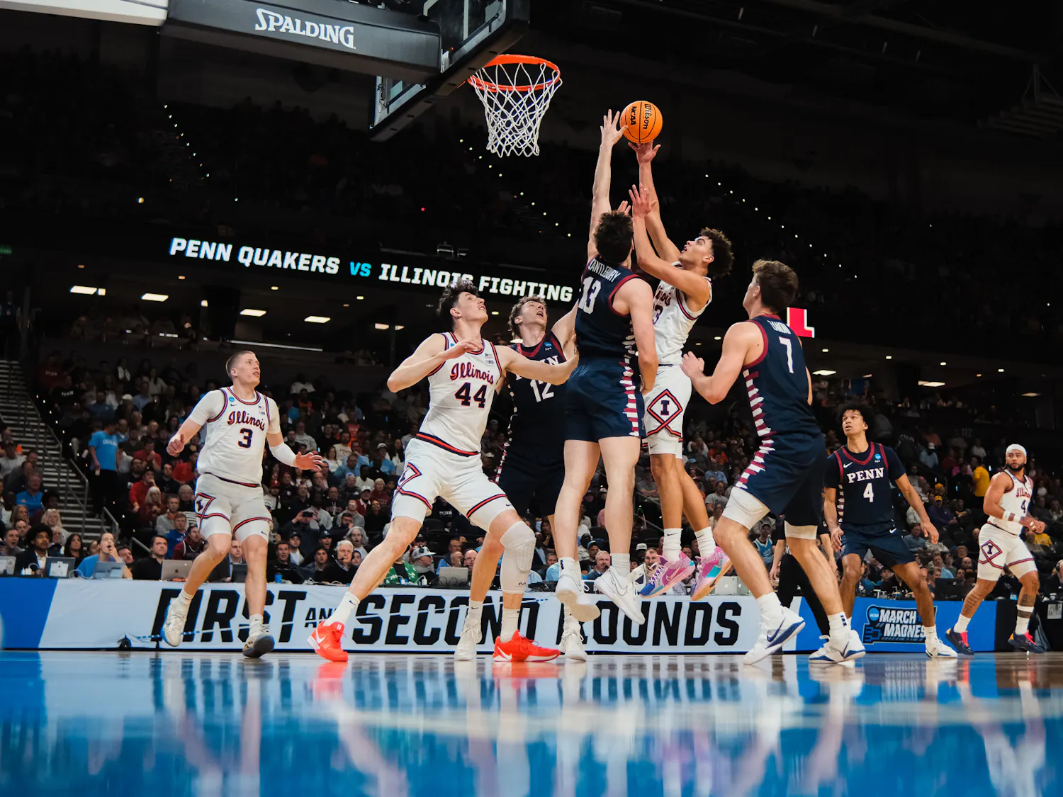
But again, the school was indecisive. The men's basketball team, for example, had to scrap its new blue jerseys after some alumni caught sight.
Again, the school let several active dissenters override the professional opinion of SME -- the cream of the crop when it comes to sports branding.
Dan Flynn, who oversees marketing for the Athletic Department, noted that probably the best result of the rebranding was consistency -- from the custom "Penn Athletics" font that SME created to the set of logos for each sport.
But this uniformity was ruined by forces outside the department.
The University has now taken this consistent set of logos and sent a message that is anything but consistent.
Sometimes players wear navy blue and other times they wear more of a royal blue. Sometimes there's a shield around Penn's logo and other times it's gone.
This is not how the rebranding firm intended things to be.
The University hired SME for a reason -- they're the very best at what they do. Unfortunately, Penn thinks it knows more than the experts. David Burrick is a senior urban studies and philosophy, politics and economics major from Short Hills, N.J., and former Executive Editor of The Daily Pennsylvanian. His e-mail address is dburrick@sas.upenn.edu


